

Branding
The Nebi UI reads its branding from a config.json that the SPA fetches before React mounts.
The chart renders that file from Helm values, so the title, logo, favicon, and color tokens are
deploy-time settings rather than build-time ones — no image rebuild, no fork of the frontend.
Every field is optional and every field falls back independently. With the whole branding block
left at its defaults nothing is rendered at all: no ConfigMap, no volume, no environment variable,
and helm template output is byte-identical to chart versions from before the feature existed.
Quick start
Section titled “Quick start”nebariapp: hostname: nebi.example.com
branding: title: "Acme Environments" logoUrl: "data:image/svg+xml;base64,PHN2ZyB4bWxucz0..." faviconUrl: "data:image/x-icon;base64,AAABAAEAEBAA..." theme: light: primary: "#0f62fe" primaryHover: "#0043ce" dark: primary: "#78a9ff"helm upgrade --install nebi nebari/nebari-nebi-pack \ --namespace nebi -f nebi-values.yamlThe pods roll on apply — see Changes roll the pods.
Values
Section titled “Values”| Value | Purpose |
|---|---|
branding.title | Browser tab title. Empty uses Nebi - Environment Management. |
branding.logoUrl | Logo in the UI header. Empty uses the built-in Nebi logo, which already switches between light and dark variants. |
branding.logoUrlDark | Optional dark-mode logo. Empty falls back to logoUrl, then to the built-in dark logo. Light mode always uses logoUrl. |
branding.faviconUrl | Favicon. Applied to every existing icon / shortcut icon / apple-touch-icon link, or added if the page has none. Empty uses the built-in favicon. |
branding.theme.light | Token overrides written to :root (light mode). |
branding.theme.dark | Token overrides written to .dark (dark mode). |
Default look
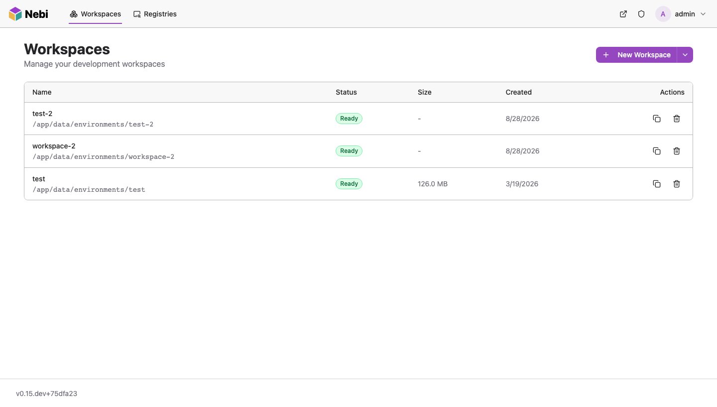
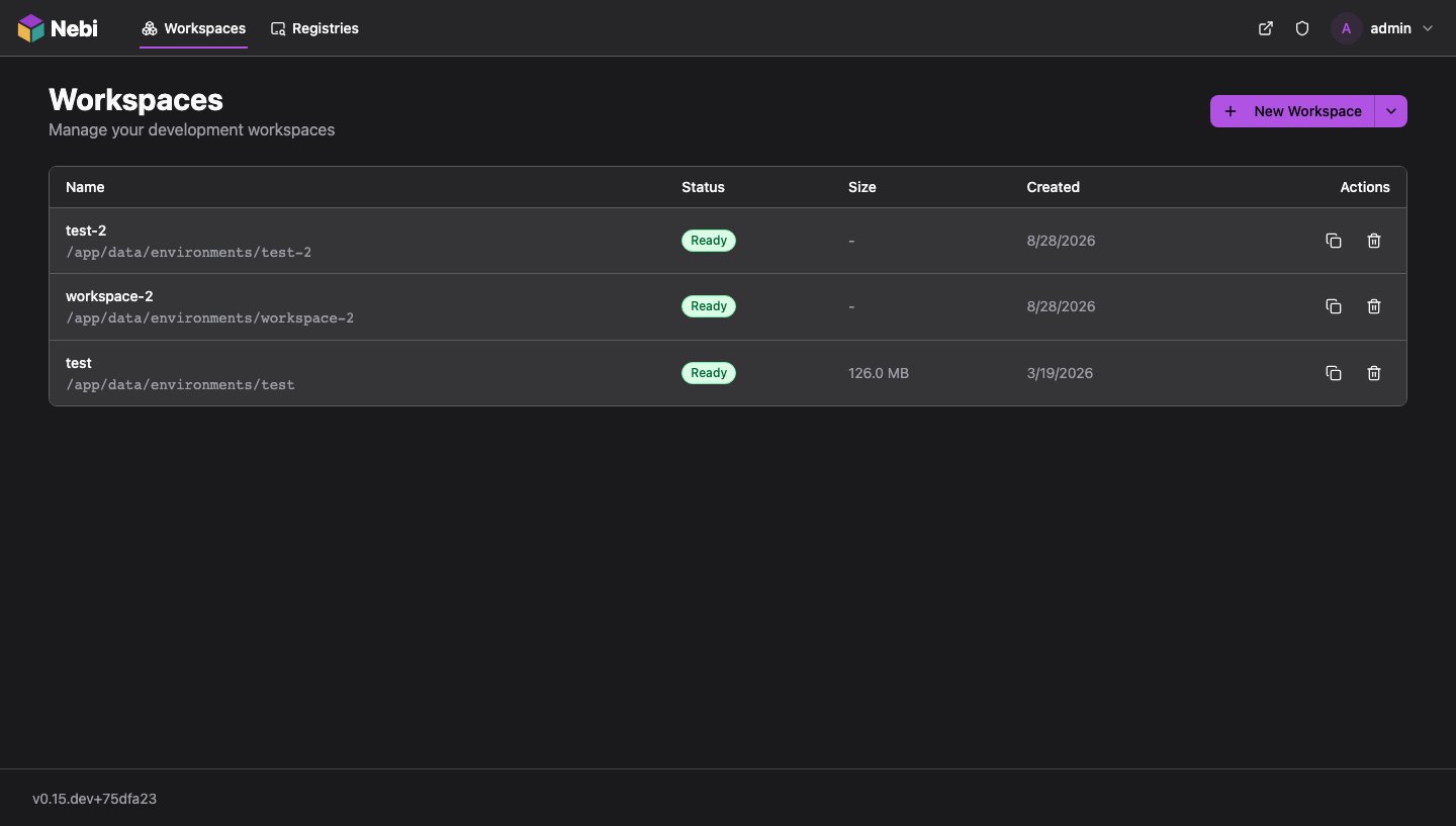
Section titled “Default look”With no branding set, Nebi renders the Nebari design system theme: a purple primary and a light gray header over a white page canvas in light mode, with a matching dark palette in dark mode. Users pick light, dark or system from the profile menu.
| Default theme, light | Default theme, dark |
|---|---|
 |  |
Logo and favicon URLs
Section titled “Logo and favicon URLs”Asset URLs must be same-origin. The frontend accepts:
- a root-relative path —
/assets/acme-logo.svg - an absolute
http(s)URL whose origin matches the page’s own - a base64
data:URI of an allowed image type —image/png,image/jpeg,image/svg+xml,image/webp,image/gif,image/x-icon,image/vnd.microsoft.icon
and rejects everything else, silently falling back to the built-in asset. External CDN URLs,
protocol-relative //host/logo.svg, javascript:, non-base64 data: URIs, and
data:text/html are all rejected.
In practice a base64 data: URI is the option that works without extra infrastructure. Nebi
serves static assets only from the frontend embedded in its image, so a root-relative path like
/assets/acme-logo.svg resolves only if something on the Nebi hostname actually serves it — it is
not a path you can drop a file into. Encode the asset instead:
# Prints a data: URI ready to paste into values (macOS/Linux)printf 'data:image/svg+xml;base64,%s\n' "$(base64 < acme-logo.svg | tr -d '\n')"Keep an eye on size — the URI travels in the ConfigMap, and a ConfigMap caps out at ~1 MiB. An optimized SVG or a small PNG is well within that; a multi-megabyte raster is not.
Root-relative URLs are resolved against the app’s base path, so they keep working if Nebi is served under a sub-path.
Dark-mode logo
Section titled “Dark-mode logo”The header switches between two surfaces: a light gray one in light mode and a dark one in dark
mode. A logo with dark text disappears on the dark header, so set logoUrlDark to a white-text or
light variant of your logo whenever you set logoUrl. Nothing inverts or recolors the logo for
you: with only logoUrl set, dark mode shows that same file unchanged.
Theme tokens
Section titled “Theme tokens”branding.theme.light and branding.theme.dark take the same set of keys. A key is a camelCase
token name from the Nebari design system; the frontend converts it to the matching CSS custom
property and writes light tokens into a :root block and dark tokens into a .dark block, in a
single <style> element appended to the head before the app mounts.
Most tokens come in a surface / foreground pair: the surface is the background of a component and the foreground is the text or icon drawn on it. When you change one half of a pair, check the other still has enough contrast.
Token reference
Section titled “Token reference”| Token | Pair | What it paints |
|---|---|---|
primary | primaryForeground | Primary buttons, links, active navigation items, selected states, the focus ring by default. |
primaryHover | – | Primary buttons on hover. |
primaryForeground | primary | Text and icons on primary surfaces. |
header | headerForeground | The top navigation bar. (1) |
headerForeground | header | Text and icons in the top navigation bar. (1) |
headerActionHover | – | Hover and pressed surface of the header’s icon and profile buttons. navHover is accepted as an alias. (1) |
signOutForeground | – | The sign-out item in the profile menu. (1) |
canvas | canvasForeground | The outermost page surface behind all content. (1) |
canvasForeground | canvas | Default text on the canvas. (1) |
background | foreground | Panels and containers that sit on the canvas, such as dialogs and menus. |
foreground | background | Default text colour. |
card | cardForeground | Cards: workspace and registry cards, detail panels, tables. |
cardForeground | card | Text on cards. |
popover | popoverForeground | Dropdown menus, comboboxes, tooltips, popovers. |
popoverForeground | popover | Text in popovers. |
secondary | secondaryForeground | Secondary buttons and badges. |
secondaryForeground | secondary | Text on secondary surfaces. |
muted | mutedForeground | Subdued surfaces: hovered nav links, disabled tabs, badges, input add-ons. |
mutedForeground | muted | Secondary text: descriptions, timestamps, helper text. The most widely used text token after foreground. |
mutedForegroundStrong | – | Slightly stronger secondary text, for labels that must stay readable on muted surfaces. (1) |
accent | accentForeground | Hovered and selected rows in menus and lists. |
accentForeground | accent | Text on accent surfaces. |
destructive | destructiveForeground | Error alerts, destructive badges and buttons. In the Nebari theme this is a pale red tint; the strong red is the foreground. |
destructiveForeground | destructive | Error text and destructive button borders. |
warning | warningForeground | Warning alerts and badges (tint). (1) |
warningForeground | warning | Warning text. (1) |
success | successForeground | Success alerts and badges (tint). (1) |
successForeground | success | Success text. (1) |
border | – | Card and panel borders, dividers. |
borderStrong | – | Emphasised borders, for example around the active tab. (1) |
input | – | Form field borders. |
ring | – | Keyboard focus ring. Defaults to a shade of primary; override it together with primary so focus stays on-brand. |
scrim | – | The translucent overlay behind dialogs. (1) |
sidebar, sidebarForeground, sidebarPrimary, sidebarPrimaryForeground, sidebarAccent, sidebarAccentForeground, sidebarBorder, sidebarRing | as named | Defined by the theme for the design system’s sidebar component. Nebi has no sidebar today, so they paint nothing. (1) |
chart1 … chart5 | – | Defined by the theme as categorical chart colours. Nebi draws no charts today, so they paint nothing. (1) |
radius | – | Base corner radius as a CSS length. The small, medium and extra-large radii are derived from it. |
(1) Requires a Nebi image that includes the Nebari design-registry frontend (nebi#460). See Image requirements.
Tokens are applied as-is; the frontend does not derive a hover or foreground colour from the value
you set. If you change primary, also set primaryHover and, if your primary is light, primaryForeground.
Token names and CSS variables
Section titled “Token names and CSS variables”The CSS variable a token becomes is an implementation detail of the frontend and has changed
between Nebi versions: on the Nebari design-registry frontend primary becomes --primary, while
older images used --color-primary. The camelCase token names are stable across both, so
prefer them.
A key that already starts with -- is passed through as a raw CSS custom property. That lets you
set a variable the table does not list, but it ties your values to one frontend version — on the
design-registry frontend a raw --color-* name is rewritten to drop the color- prefix so older
values keep working.
Value restrictions
Section titled “Value restrictions”Values are sanitized in the browser. A value is dropped if it contains any of ; < > {
} " ' \ or url(, expression(, or javascript:. Any CSS color notation without those
characters works — #0f62fe, rgb(15 98 254), hsl(217 98% 53%), oklch(0.55 0.22 260).
radius takes a CSS length such as 0.25rem or 6px.
Note that the quote restriction means font-family stacks containing quoted names cannot be set this way; fonts are not runtime-configurable.
Numbers are safe to write unquoted in values — the chart coerces token values to strings, because
the frontend ignores non-string values and an unquoted radius: 0.5 would otherwise be dropped.
Complete example
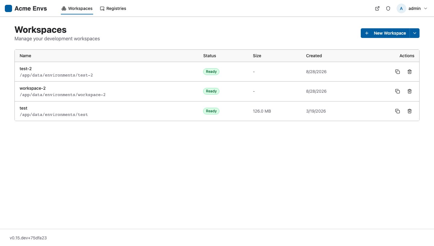
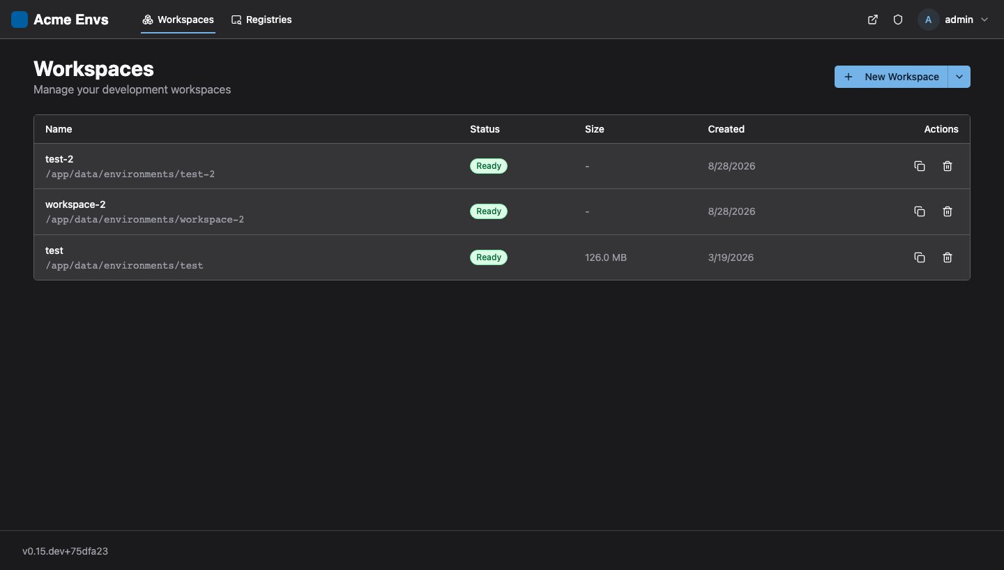
Section titled “Complete example”A blue brand with a white header in light mode. Dark mode keeps the Nebari dark surfaces and only lifts the primary to a lighter blue so it reads on them:
branding: title: "Acme Environments" # Dark wordmark for the light header, white wordmark for the dark header. logoUrl: "data:image/svg+xml;base64,PHN2ZyB4bWxucz0..." logoUrlDark: "data:image/svg+xml;base64,PHN2ZyB4bWxucz0..." faviconUrl: "data:image/png;base64,iVBORw0KGgo..." theme: light: primary: "#005ea2" primaryHover: "#1a4480" primaryForeground: "#ffffff" ring: "#005ea2" header: "#ffffff" headerForeground: "#2e2f33" headerActionHover: "#f0f0f0" radius: "0.375rem" dark: primary: "#73b3e7" primaryHover: "#aacdec" primaryForeground: "#0b1a2a" ring: "#73b3e7" # Keep the Nebari dark header: without these, the light header above # would apply in dark mode too. header: "oklch(26.94% 0.0037 286.15)" headerForeground: "oklch(97.91% 0 0)" headerActionHover: "#4a4a50" radius: "0.375rem"The result: blue primary buttons, links and focus rings in both modes; a white top bar with dark text and your dark wordmark in light mode; the standard dark gray top bar with your white wordmark in dark mode; and slightly squarer corners everywhere. Every token not listed keeps its Nebari default, so cards, menus, form fields and status colours stay consistent with other Nebari apps.
The three header* values under dark are the Nebari dark defaults. The same trick works for any
token you want to change in one mode only: set it in that mode and restore the default in the
other. The Nebari defaults for the most commonly restyled tokens are:
| Token | Light default | Dark default |
|---|---|---|
primary | oklch(55.06% 0.1886 311.45) | oklch(61.98% 0.2159 311.67) |
primaryHover | oklch(47.01% 0.1577 311.26) | oklch(69.98% 0.1926 311.48) |
primaryForeground | oklch(100% 0 0) | oklch(0% 0 0) |
ring | oklch(61.98% 0.2159 311.67) | oklch(69.98% 0.1926 311.48) |
header | oklch(97.91% 0 0) | oklch(26.94% 0.0037 286.15) |
headerForeground | oklch(26.94% 0.0037 286.15) | oklch(97.91% 0 0) |
headerActionHover | #d9d9dc | #4a4a50 |
canvas | oklch(100% 0 0) | oklch(21.86% 0.0039 286.08) |
background | oklch(97.91% 0 0) | oklch(26.94% 0.0037 286.15) |
card | oklch(100% 0 0) | oklch(33.01% 0.0052 286.11) |
| Branded, light | Branded, dark |
|---|---|
 |  |
Choosing dark-mode values
Section titled “Choosing dark-mode values”theme.dark is not a copy of theme.light; it is a separate palette drawn on dark surfaces.
- Mirror every light token in
dark. A token set only undertheme.lightapplies in dark mode too (see the caution above). For the brand colour that means choosing a dark-mode value: most brand colours tuned for white are too dark on a dark surface, so use a lighter tint intheme.dark.primaryand flipprimaryForegroundto a dark colour if the tint is light enough to need it. - Keep the pairs together. For every surface you set, check its foreground:
primarywithprimaryForeground,headerwithheaderForeground,cardwithcardForeground, and so on. Aim for a contrast ratio of at least 4.5:1 for text and 3:1 for large text and icons. - Leave the neutrals alone unless you must.
canvas,background,card,popover,muted,borderandinputare tuned as a set in both modes. Overriding one dark surface usually means re-tuning the rest. - Status colours are tints.
destructive,warningandsuccessare pale backgrounds and the*Foregroundtokens carry the strong colour, in both modes. Keep that relationship if you restyle them. - Rebrand the header in light mode only if your header colour is white or very light, and
restore the Nebari dark header under
theme.darkas in the example. That matches jhub-apps, which applies its navbar colours in light mode only, so the two apps stay consistent.
Consistent platform branding
Section titled “Consistent platform branding”Other Nebari apps render the same design-system tokens from their own configuration. For
JHub Apps, which takes snake_case keys in
c.JupyterHub.template_vars, the equivalents are:
Nebi branding value | JHub Apps template_vars key |
|---|---|
logoUrl / logoUrlDark | logo (dark variant picked by the Black-text → White-text filename convention) |
faviconUrl | favicon |
theme.light.primary and theme.dark.primary | primary_color (applied in both modes) |
theme.light.primaryHover and theme.dark.primaryHover | primary_color_dark |
theme.light.header | navbar_color (light mode only) |
theme.light.headerForeground | navbar_text_color (light mode only) |
theme.light.headerActionHover | navbar_hover_color (light mode only) |
| – | font_family / font_url (not runtime-configurable in Nebi) |
JHub Apps applies one primary_color to both modes, so give it the light value and let Nebi’s
theme.dark.primary carry the lighter tint.
How it works
Section titled “How it works”When any branding field is non-empty, the chart renders three extra things:
- A ConfigMap named
<fullname>-brandingholding aconfig.jsonwith only the fields you set. - A read-only volume mounting that ConfigMap at
/etc/nebi/branding— mounted as a directory, not withsubPath, so kubelet keeps the file up to date in place. NEBI_BRANDING_CONFIG_PATH=/etc/nebi/branding/config.jsonon the Nebi container.
Nebi serves that file at /public/config.json in place of the copy baked into the image, and the
SPA fetches it at startup, applying the title, favicon, logo, and theme tokens before it mounts. If
the fetch or parse fails, the app logs a warning and renders with its built-in defaults.
The rendered config.json for the quick-start values above:
{ "branding": { "faviconUrl": "data:image/x-icon;base64,AAABAAEAEBAA...", "logoUrl": "data:image/svg+xml;base64,PHN2ZyB4bWxucz0...", "theme": { "dark": { "primary": "#78a9ff" }, "light": { "primary": "#0f62fe", "primaryHover": "#0043ce" } }, "title": "Acme Environments" }}Only the fields you set are emitted. An unset field is omitted rather than written as "", and a
color scheme with no tokens is dropped entirely — so each missing field falls back to the
frontend’s built-in default.
Changes roll the pods
Section titled “Changes roll the pods”The Deployment carries a checksum/config annotation over the branding ConfigMap. Editing branding
values therefore changes the pod template and triggers a rollout, instead of appearing to apply
cleanly while the running pod keeps serving the old file.
Note that strategy.type is Recreate — the environments volume is ReadWriteOnce, so the old
pod terminates before the new one starts and there is a brief gap in availability.
Image requirements
Section titled “Image requirements”Runtime branding needs a Nebi image that supports it:
| Feature | Requires |
|---|---|
title, logoUrl, faviconUrl, theme | Nebi with runtime theming support — the tag pinned in values.yaml has it. |
logoUrlDark | A newer Nebi than the pinned tag (nebi#516). On an older image the key is ignored and dark mode keeps using logoUrl, so setting it early is harmless but has no effect until you bump image.tag. |
| Tokens marked (1) above | A Nebi image with the Nebari design-registry frontend (nebi#460). Older images accept background, foreground, card, cardForeground, popover, popoverForeground, primary, primaryForeground, primaryHover, navHover, secondary, secondaryForeground, muted, mutedForeground, accent, accentForeground, destructive, destructiveForeground, border, input, ring and radius; other keys are written but paint nothing. |
Verifying a deploy
Section titled “Verifying a deploy”# The file the chart renderedkubectl get configmap nebi-nebari-nebi-pack-branding -n nebi \ -o jsonpath='{.data.config\.json}'
# The file the pod is actually servingkubectl exec deploy/nebi-nebari-nebi-pack -n nebi -- cat /etc/nebi/branding/config.json
# What the browser fetchescurl -s https://nebi.example.com/public/config.jsonIf the UI still looks unbranded, check that the pod restarted after your last helm upgrade, then
open the browser console — a rejected logo URL or dropped theme value is a validation failure in
the SPA, not a chart problem. A token that is accepted but paints nothing is usually one the
running image does not know; see Image requirements.
Testing chart changes
Section titled “Testing chart changes”The branding render path has its own test suite, since branding is off by default and the standard
helm template smoke checks never exercise it:
make testIt asserts the default render is unchanged, that any single field switches branding on, and that
the config.json comes out in the shape the SPA expects.